We have talked about not being too daring with colors if you plan on reselling your custom home, but that does not mean you need to be perfectly boring. There are plenty of color trends that are, were, and will remain popular with most people. As long as you don’t step out too far into an “overly” trendy paint scheme, you will be fine.
So, we will look at some of the trends we are seeing today with custom-built homes. Paint companies and design magazines are all putting out their favorite “color of the year.” Now, I will admit, some of them are a bit over the top, but that is not to say that they could not be used as an accent or in a very specific room, such a reading room, smoke room, or wine cellar.
The Colors
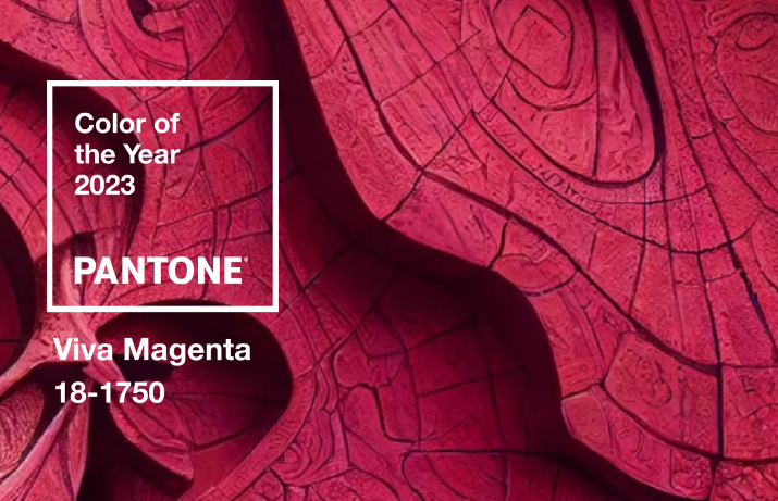
Viva Magenta by Panton
This is part of the red color family and it is a very bold pink color. The color is very prominent in fashion, so it has naturally started to work its way into interior design. Due to the boldness of the color, you may want to limit this to furnishings rather than covering a wall with it (or use it as an accent color or accent wall). You can also see design ideas put together by Pantone on its website, click here.
(Warm) Yellow by Nordroom
There are several colors that fall under this tag:
- Farrow & Ball Babouche
- Little Green Light Cold
- Behr Luscious Lemon
- Benjamin Moore Buttercup
- Farrow & Ball India Yellow
I have seen yellows being used more and more often in homes, especially in kitchens and reading rooms. For those that prefer “period” homes that are furnished with antiques, this color is perfect to offset the deep, rich color of many of those furnishings. Nordroom states that these colors enhance “the historic feeling of the home as it’s a shade that has been used in homes for centuries.”
Benjamin Moore: Raspberry Blush
This is a coral that has been given just a hint of pink. Again, this a bold color, but you can see where these paint companies are going right now. Again, I am not so sure an entire room would work with this color, but I can definitely see it as an accent color or an accent wall, which have become popular in recent years.
In addition, Benjamin Moore has published a color palette to complement the color of the year:
- Raspberry Blush
- Conch Shell
- Cinnamon
- Wenge
- Savannah Green
- New Age
- Starry Night Blue
- North Sea Green
Two of my favorites here are Wenge and Starry Night Blue, which you can see in the link below. You can also check out the design ideas on Benjamin Moore, click here.
To room design ideas using these colors, you can visit The Nordroom, click here.
To see Part 2 of this series, click here.


[…] If you missed Part 1 of this series, click here. […]
[…] read Part 1, click here. To read Part 2, click […]