If you missed the two previous parts of our color trends series, please check them out when you get the opportunity.
Now, let’s get back at it!
Behr: Blank Canvas
As you might expect, this is a warm white that opens the door to any design ideas you have in mind. It is obviously a very safe color that will not hurt you on resale at all. Behr has done significant research on colors that homeowners want, and its study suggests that people want colors that lower stress and allow them to relax, so they are staying away from the much bolder colors we are seeing from other companies.
White will always be a timeless color, but the richer shade of white here adds a bit of character to the color that will hold up for years.
Graham & Brown: Alizarin
Again, we have a company that is stepping out with a shade of red that is very bold. The color will add warmth to a room, but it may be a bit much in terms of using as a primary color, at least for me. I can see this working much better as an accent color in a library, wine room, or even a bedroom.
Graham & Brown definitely offers up some bold designs to go with this color, which I recommend you check out if this is something you are interested in using. To see their color palette and design ideas, click here.
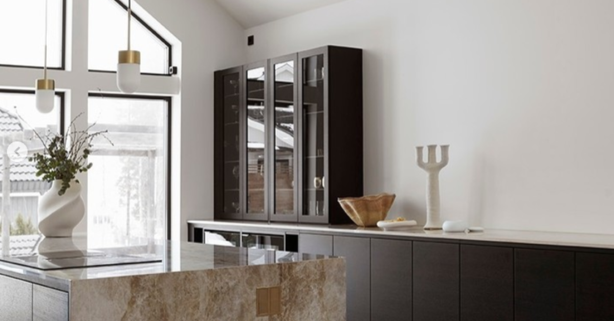
Jotun LADY
This is, by far, one of my favorite color palette designs of the year. Jotun LADY has done an exceptional job of creating design ideas that I think would work wonderfully in just about any home. If you have Instagram, I highly recommend you give them a follow. It was honestly hard to be overly critical of just about room design they presented.
To see Jotun LADY’s design ideas on Instagram, click here.
Dunn-Edwards: Terra Rosa
Staying with reds as a big trend this year, Dunn-Edwards has chosen Terra Rosa as its color of the year. They describe it at a “deep, rosy pink hue with a touch of terra-cotta influence that exudes confidence, creativity and coziness. Reflecting just the right amount of introspection, this high chroma cinnamon rose hue is strong, yet approachable, and acts as a refreshing neutral update to browns and burgundies.”
They have also put together several color palettes to help with design ideas:
- Live in Joy
- Liberated Nomads
- Well Intentions
- Live in Poetry
To see the full-color palettes and design ideas by Dunn-Edwards, click here.
We hope this helps you in choosing the palette for your home!
Source: The Nordroom


